Mobile-First Shopify Theme Design
Mobile drives 70%+ of Shopify traffic, so we design and build mobile-up — thumb-friendly targets, sticky add-to-cart bars and swipeable galleries. Desktop scales from that foundation instead of the other way round.
Book a Free Technical Call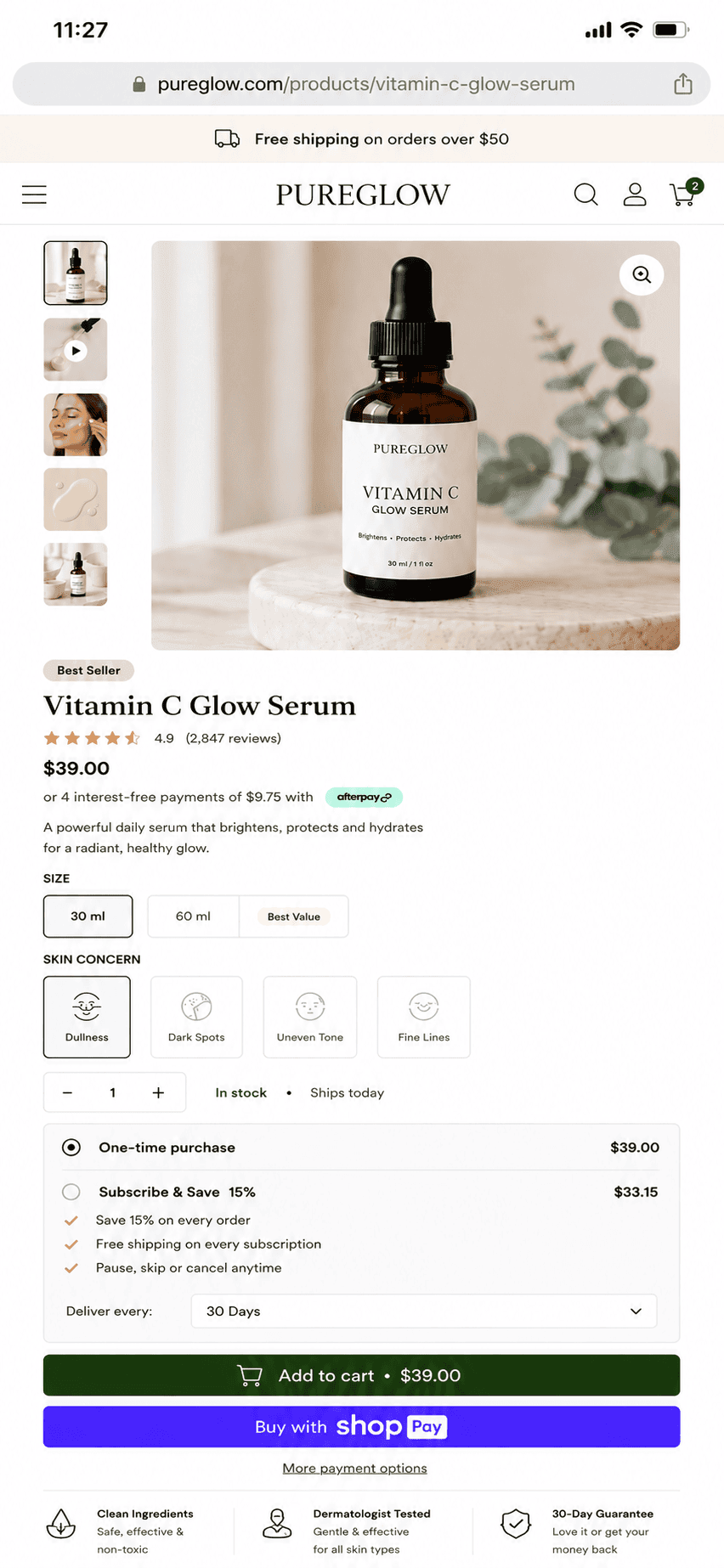
Why it matters
Most stores are designed on a 27-inch monitor and sold on a 6-inch phone.
When desktop is designed first, mobile becomes a compression exercise — text shrinks, columns stack awkwardly, and the add-to-cart button ends up below three scrolls of content. That gap shows up directly in the numbers, because mobile is usually where the majority of sessions happen and where conversion is weakest. Designing mobile-up forces the important decisions early: what actually earns its place above the fold, how the shopper reaches the buy button with one thumb, and what can be deferred. Desktop then gets more room rather than a different, better-considered experience.
Sound familiar?
Mobile problems are invisible in a desktop mockup.
These show up on a real phone, in real daylight, with one thumb — and almost never in a design review.
- Your mobile conversion rate is less than half your desktop rate and nobody knows why.
- Reaching add to cart takes three scrolls on a phone and one glance on desktop.
- Filters open as a cramped dropdown that covers the results a shopper is filtering.
- Buttons sit close enough together that you tap the wrong one yourself, regularly.
- Sticky header, cookie banner and chat bubble between them eat half the phone screen.
- You assume phone shoppers only browse, and that the real buying happens later on desktop.
What's included
What mobile-first means in practice
Real decisions made for small screens and slow networks — validated on physical devices, not just a browser resize.
Designed for thumbs
Minimum 44px tap targets with real spacing between them, primary actions inside natural thumb reach, and sticky add-to-cart bars so the buy button is always one tap away. Forms use the correct input types and keyboards, which removes a surprising amount of checkout friction on mobile.
Per-breakpoint layouts
Mobile, tablet and desktop layouts are crafted independently rather than scaled from one design. Navigation, product galleries and filters each get the treatment that suits the screen — a drawer and swipeable gallery on mobile, a persistent sidebar and grid on desktop.
Tuned for mobile networks
Smaller responsive images, lighter JavaScript payloads and deferred non-critical assets on mobile connections. We test on throttled 3G and mid-range Android hardware, because a store that only feels fast on office wifi and an iPhone Pro isn't actually fast.
Mobile commerce patterns
Full-bleed swipeable product galleries with pinch-zoom, bottom-sheet variant pickers, collapsible product detail sections, and filters that open as a sheet instead of a cramped dropdown. These are the interaction patterns shoppers already know from native apps.
Touch and assistive-tech friendly
Gestures always have a visible, tappable alternative, focus states survive touch and keyboard, and text stays legible without zoom. Mobile accessibility is where most themes quietly fail WCAG, so we test it as part of the build rather than after a complaint.
Verified on real devices
Every build gets QA on physical iOS and Android devices across screen sizes — including the checkout path end to end. Emulators miss real issues: sticky bars fighting browser chrome, safe-area insets on notched phones, and momentum-scroll quirks.
How it runs
How a mobile-first build actually runs.
Typically 3–6 weeks alongside a theme build, starting at 375px and widening outwards from there.
- 01
Watch real sessions
Before anything is drawn, we go through your mobile funnel and session recordings, then shop your own store on a mid-range phone. Most of the losses become obvious inside twenty minutes.
- 02
Design at 375px
The narrowest layout is designed first, so content order and hierarchy get decided under real constraint. Anything that can't earn its place on a small screen rarely deserves one on a large screen.
- 03
Widen deliberately
Tablet and desktop are drawn as their own layouts once mobile is settled, never stretched from it. Breakpoints go where the design actually breaks, not at a list of device widths.
- 04
Test in hand
QA happens holding actual phones, one-thumbed, all the way to a completed order. The bugs that only appear on real hardware in real light are the ones costing you sales.
70%+
Traffic is mobile
Typical Shopify store
44px
Min tap target
WCAG 2.1 AA
3G
Tested network
Throttled, real devices
Mobile-up
Design order
Not shrunk from desktop
Straight answer
Mobile-first rebuilds the decisions, not just the stylesheet.
A good fit if…
- Most of your sessions come from phones and most of your revenue still doesn't.
- You're redesigning anyway, so the mobile layout can lead rather than trail behind.
- Your catalogue needs genuine filtering, comparison or variant choice on a small screen.
- You sell to a social-led audience who will only ever see the phone version.
Probably not, if…
- You want the current desktop design squeezed onto a phone — that's a different, cheaper job.
- You're B2B and your buyers order from desks; your traffic may not justify this.
- You need launch in two weeks. Designing each breakpoint properly takes longer than one pass.
- Your mobile problem is actually speed. Fix Core Web Vitals first, then re-measure before redesigning.
Keep exploring
More on Shopify theme development
Mobile-First Design is one part of how we build Shopify themes. Here's the rest of the picture.
Shopify Theme Development
The complete service — design, build, launch and everything below, in one engagement.
View the serviceClosely relatedPerformance-First Themes
Mobile speed is where Core Web Vitals are won or lost — see how we budget performance.
Read the guideClosely relatedConversion-Optimised PDP & PLP
The product and collection patterns that convert best on small screens.
Read the guideAll guides in this series
- Custom Theme DevelopmentFigma to production Liquid — a bespoke Online Store 2.0 theme from scratch.
- Theme Customization & ExtensionsCustom sections, blocks and app extensions on the theme you already run.
- Accessibility (WCAG 2.1 AA)Keyboard, screen-reader and contrast compliance built in, not bolted on.
- Theme Migration & ModernisationVintage themes moved to Online Store 2.0 with no design regressions.
- Headless / Hydrogen ThemesReact storefronts on Oxygen — for when Liquid genuinely hits its ceiling.
Beyond this service
Other things we do
Most stores need two or three of these working together. Book a call and we'll tell you which ones actually move your numbers.
- Shopify Theme DevelopmentCustom themes built from Figma to production Liquid on Online Store 2.0 — fast and merchant-editable.
- Shopify App DevelopmentCustom and public apps, Checkout UI Extensions and Shopify Functions built with React and Polaris.
- Shopify MigrationMove from WooCommerce, Magento or BigCommerce with a full 301 redirect map and zero downtime.
- Shopify SEOTechnical audits, Core Web Vitals, structured data and collection content built around buyer intent.
- Shopify Performance OptimizationFaster load times and green Core Web Vitals — theme refactors, image pipelines and app cleanup.
- Shopify A/B TestingHypothesis-led experiments on product pages and checkout, shipped as native theme code.
- Shopify Email Marketing & KlaviyoFlows, segmentation and campaigns — welcome, abandoned cart, winback and SMS, built and monitored.
- Shopify CRO & FunnelsValue-ladder, tripwire, quiz and post-purchase upsell funnels built to lift conversion and AOV.
- Shopify Maintenance & SupportRetainers covering uptime monitoring, security patching, bug fixes and proactive improvements.
Frequently asked questions
- No. Responsive just means the layout adapts; mobile-first means the mobile experience is designed first and desktop expands from it. A responsive desktop-first theme technically works on a phone, but the hierarchy, tap targets and content order were decided for a mouse and a large screen — which is where most of the conversion loss happens.
Is your store actually built for mobile?
Book a 30-minute technical call. We'll walk your store on a real phone and show you where mobile shoppers are dropping off.
Book a free call